The Ultimate Guide To Optimizing Your WordPress Theme For Gutenberg
WordPress 5.0 and the new Gutenberg editor are almost here. Is your theme ready?
As the release of WordPress 5.0 grows near, there’s panic in the air regarding theme preparation. Fortunately, most of the panic is unnecessary. WordPress 5.0 will be backwards compatible, as all major WordPress releases have been. Meaning, the update “should” not break your WordPress theme. However, there are always exceptions.
Organic Themes has always developed products with “no added hormones”. We believe less is more, and focus on optimizing our products for WordPress specific features and functionality. As a result, Organic Themes are prepared for Gutenberg. However, there are additional steps that can be taken to optimize your WordPress theme for the new WordPress 5.0 content editor. We’ll get to that. But first, let’s make sure you understand what Gutenberg is, and why it’s a big deal. If you already know, skip ahead.
A Brief History Of Gutenberg
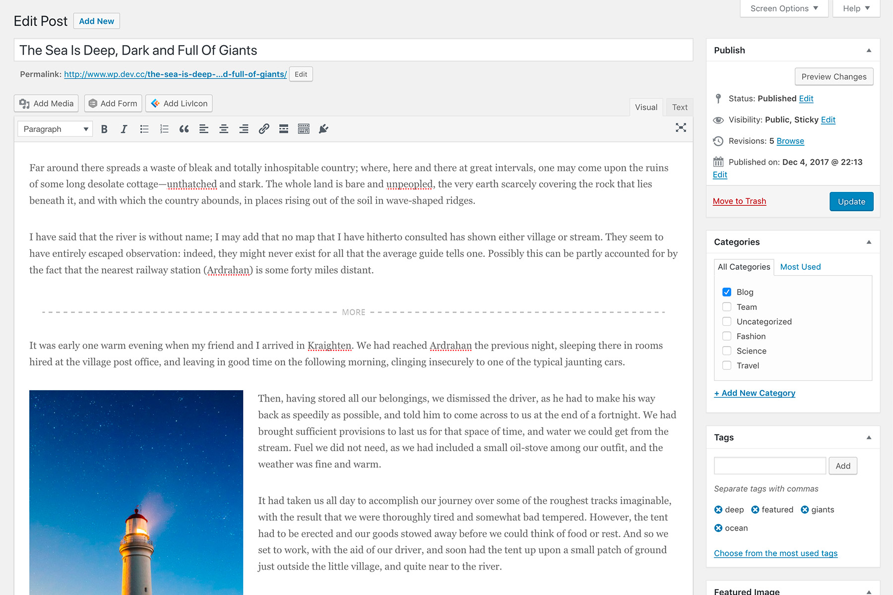
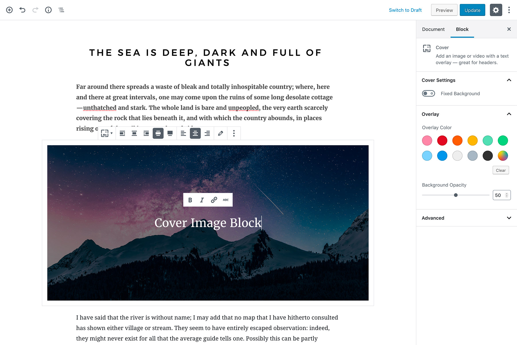
Gutenberg is the name given to the new content editor that will launch in late November with the release of WordPress 5.0. It’s perhaps the most significant update since the release of WordPress 3.0 — over 8 years ago. The new editor will change the way in which website content is added using WordPress. The “classic” editor will be replaced with a new block editing interface. As a result, content will be added in the form of “blocks”. Those blocks can be individually manipulated and moved, adding much more control over the display of your content.
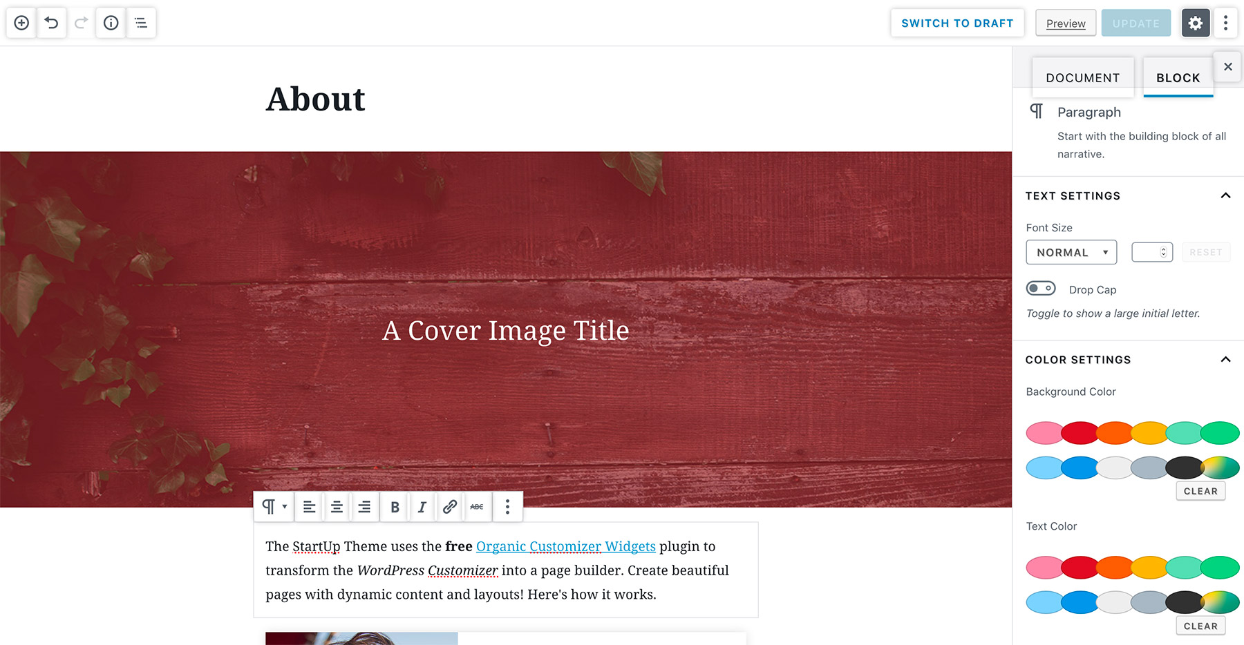
Let’s compare:
It’s a much needed update in order for WordPress to continue its reign as the best content management platform for websites. However, the change is surrounded by controversy. The Gutenberg plugin has many scathing reviews in the WordPress plugin directory. In fact, the most downloaded Gutenberg related plugin is the Disable Gutenberg plugin. Despite the backlash, Gutenberg has come a long way over the course of its beta development. As of this article, Gutenberg is a solid content editor, and a vast improvement over the classic editor in our opinion. There is no reason to fear this change.
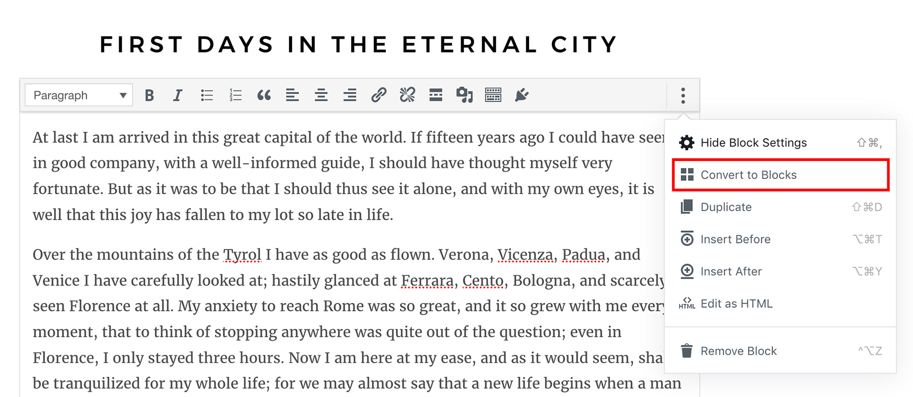
If you’re still concerned about converting your old page and post content to Gutenberg blocks — remember, you don’t have to. All your old content will exist in the classic editor block until you choose to convert it. Basically, nothing will change unless you want it to. Upon converting the content to blocks, the worst case scenario will be addressing some spacing and alignment issues.
Organic Themes has been using and testing the Gutenberg editor since its announcement last year. We were among the first WordPress theme shops to embrace Gutenberg — releasing a free Profile Block plugin, tutorial and the optimized Block Lite theme. So, we know what it takes to optimize a theme for the new editor.
Optimizing A Theme For Gutenberg
While preparing your WordPress theme for Gutenberg compatibility may not be a necessity, there are steps that can be taken to optimize your theme for the new editor. That will be the focus of this article moving forward.
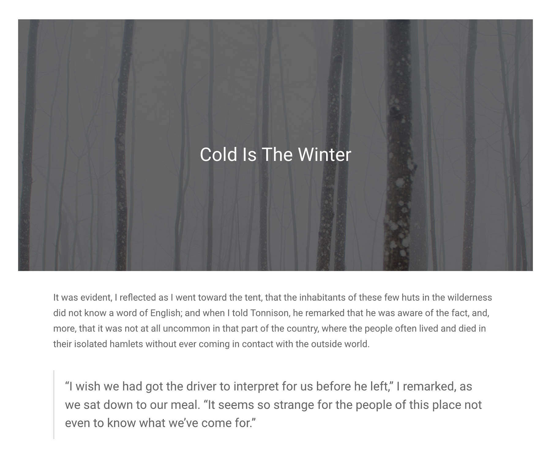
Full And Wide Alignment Blocks
Gutenberg provides several options for the various block types included with the new editor. Among those, is the option for wide and full width block alignment. Meaning, the block can extend beyond the width of your content, or even the full width of your browser window. However, this option is not enabled by default. It requires adding theme support and styles to take advantage of this new feature.
For the purposes of this tutorial, I will be providing code from our Gutenberg optimized starter theme, the Origin Theme.
Adding Theme Support
First, let’s begin by adding support for wide alignment blocks within your theme functions.php file:
Conditional Sidebar Classes
Before adding the block alignment styles, we need to determine if there is a sidebar present on the page. If your page contains a sidebar, you probably do not want a block extending to the full width of the browser window. This is because the wide or full aligned block would probably cover your sidebar widgets — creating undesirable results. So, we need to add a conditional body class to the theme that determines whether or not a sidebar is present on the current page. Then, we can use the conditional class in our block alignment styles.
A conditional body class can be added within your theme functions.php file like so:
Keep in mind, the body class code provided above will most likely need to change depending on the names and number of sidebars provided with your theme. In our case, the Origin Theme features the option for a single sidebar on pages and posts. Additionally, the theme contains a full width page template and WooCommerce compatibility. As a result, conditional operators are used to account for those unique pages and post types. Your theme may need more or less operators, depending on the number of sidebars, page templates, and custom post types supported by your theme.
Wide And Full Block Styles
Confirm that the sidebar class is conditionally added to the body tag of your website by inspecting the code. Then, begin adding the conditional block alignment styles:
Additionally, for a responsive website, you should add mobile styles for the wide and fully aligned blocks. This can be done by wrapping your styles in a media query for mobile devices. The following code is for wide and full blocks on mobile phones:
Now, your WordPress theme will fully support the use of wide and fully aligned blocks!
General Block Styles
Gutenberg blocks contain default styles. However, those styles may conflict with other theme styles. As a result, it’s best to add some block styles of your own for consistency.
Global Block Style
With the exception of the paragraph block, most blocks have a unique class applied. However, rather than targeting each block individually, you may want a single style that effects all blocks. This is useful for keeping our code concise, and making style changes to blocks on a global scale.
Since all block classes begin with the “wp-block” identifier, we will use an attribute selector style to target all elements containing that class name, like so:
Individual Block Styles
Many blocks contain styles that may override the styles within your theme. As a result, the appearance of content may not be consistent between pages created using the classic editor, and pages created with Gutenberg. In order to solve this, we’ll need to add block classes to many existing theme styles. This should retain consistency between the appearance of content added using either editor.
In the case of the Origin Theme, we have added the following block styles:
Front-end Styles In Gutenberg Editor
For a more seamless user experience, you may want the content added within the Gutenberg editor to reflect the fonts and styles on the front-end of your website. Unfortunately, the content added within the Gutenberg editor will not automatically appear as it does on the front-end of your website. However, this can be remedied with some additions to your WordPress theme.
Create Editor Stylesheet
First, we’ll create a separate stylesheet. Within the Origin Theme, we have named this stylesheet gutenberg.css, and added it within the “css” theme folder. For reference, the full contents of the stylesheet are provided below:
Unique Editor Classes
Before continuing, let’s break down some of the important class names required for targeting elements within the editor. Failure to use these classes may result in targeting elements within the WordPress dashboard outside of the editor window. In short, things will look funky — kinda like this:
To make sure only elements within the editor are targeted, add the .editor-styles-wrapper class in front of the elements you wish to target. This may not be necessary for all elements, but it’s good practice.
Another commonly used editor class is .editor-rich-text__tinymce. This class will need to be appended to more common HTML elements. For instance, your theme may style a heading like so:
However, adding that style to the editor stylesheet will not work as expected. It will be overwritten by the default Gutenberg editor styles. So, in order for that heading to appear as it does on the front-end of our site, we need to rewrite the style like this:
That will ensure our editor style takes precedence over the default editor styles. This may vary somewhat depending on the element and the block you are targeting within the editor. It’s best to use your code inspector as necessary in order to target elements directly.
Enqueue Editor Stylesheet
Next, let’s enqueue the editor stylesheet within your functions.php file:
You may need to adjust the path to the stylesheet accordingly for your theme.
Summary
That’s it! By adding theme support for wide alignment blocks, block styles, and an editor stylesheet, your WordPress theme will be fully optimized for Gutenberg. All Organic Themes are compatible with Gutenberg, and many have already been optimized for the new editor. There are exciting changes on the horizon with WordPress 5.0, and we’re ready to help with the transition!